Health & Fitness / Growth Funnel
Reverse Health Funnel Optimization & A/B Testing
A growth case study turning funnel insights into testable design solutions.
Year
2026
Role
Sr. Product Designer
Client
Reverse Tech
Overview
Structure
My Role
- Funnel Data Interpretation
- UX & Conversion Problem Identification
- Paywall Experiment Design
- Testable Design Solution Framing
Tools Used
- Figma
- Codex
- Claude Design
- Claude Code
- Open Design
- Notebook LM
- ChatGPT
- GitHub
- Copilot
- Grammarly
Timeline
5 to 7 days
Case Study
The problem
Reverse Health was running a 44-step quiz funnel that sold a calisthenics program for women. End to end, the funnel was converting at 0.63%.
Traffic was mostly cold paid search, with a typical visit beginning from a Google ad. Inside the team, the most intuitive explanation was that the long quiz middle, more than 37 steps, had to be where users were dropping.
Context
The scope of the work centered on funnel diagnosis and design improvements, paywall experiment design, and competitor pattern extraction.
My role was to interpret funnel data, identify UX and conversion problems, and translate those insights into concrete, testable design solutions inside a performance-driven product environment.
Task 1
Funnel diagnosis & design improvements
Identify where users drop off across the quiz and email gate, diagnose the root cause of each churn point, and design improvements prioritized by conversion impact.
Task 2
Paywall experiment design
Design a structured A/B test plan targeting the paywall conversion gap, with hypotheses covering offer framing, value exchange, and pricing presentation.
Task 3
Competitor pattern extraction
Analyze how competing subscription fitness apps structure their onboarding and paywall flows to surface patterns worth adapting or testing against the current design.
Task 4
Impact metrics
Set a measurable conversion target and the primary, diagnostic, and guardrail metrics needed to evaluate the proposed funnel experiments.
Task 5
How I used tools while completing this case
A transparent breakdown of how AI-assisted tools supported analysis, exploration, writing, and delivery — with human judgement guiding the problem framing, decisions, and final quality.
Funnel diagnosis
Rather than treat every step as equal, I read all 44 and picked 3 to examine, balancing churn, user volume, and downstream influence. Then for each I dug into two questions: why it performs the way it does, and what user behavior, friction, or clarity issue explains the data.
Funnel churn snapshot
Highest visible churn points across the quiz entry and progression flow
| EVENT - STEP | PERFORMANCE | CHURN # | CHURN % | USER # | REMAINING % |
|---|---|---|---|---|---|
Age | Good | 7 | 0.13% | 5,403 | 18.03% |
Main Goal | Moderate | 224 | 3.20% | 6,784 | 22.64% |
Enter EmailDesign pick | Poor | 1,156 | 21.62% | 4,190 | 13,99% |
Age
GoodChurn #
7
Churn %
0.13%
User #
5,403
Remaining %
18.03%
Main Goal
ModerateChurn #
224
Churn %
3.20%
User #
6,784
Remaining %
22.64%
Enter Email
PoorDesign pickChurn #
1,156
Churn %
21.62%
User #
4,190
Remaining %
13,99%
Age
A clear, low-effort step. By this point abandoning the flow would feel wasteful, so users push through. The cognitive and emotional load is minimal, there's no financial decision attached, and most people understand that age matters in a health plan.
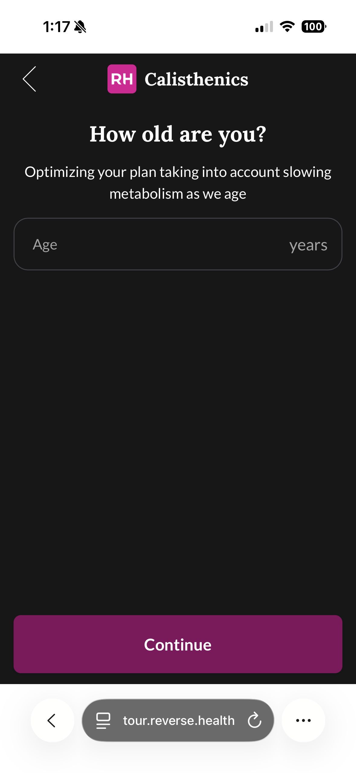
Consideration
Age is asked twice, on the landing and again at step 31. Testing it on a single step could cut effort and shorten the funnel.
Main Goal
The single-select option keeps it light and avoids decision overload for users. The friction is more subtle: this is the moment the user tells the product what outcome they want, so naming one goal carries emotional weight. A hypothesis, based on research, is that selecting a goal adds weight and that can feel like pressure, especially when the options don't fully align with the user or they haven't decided yet.
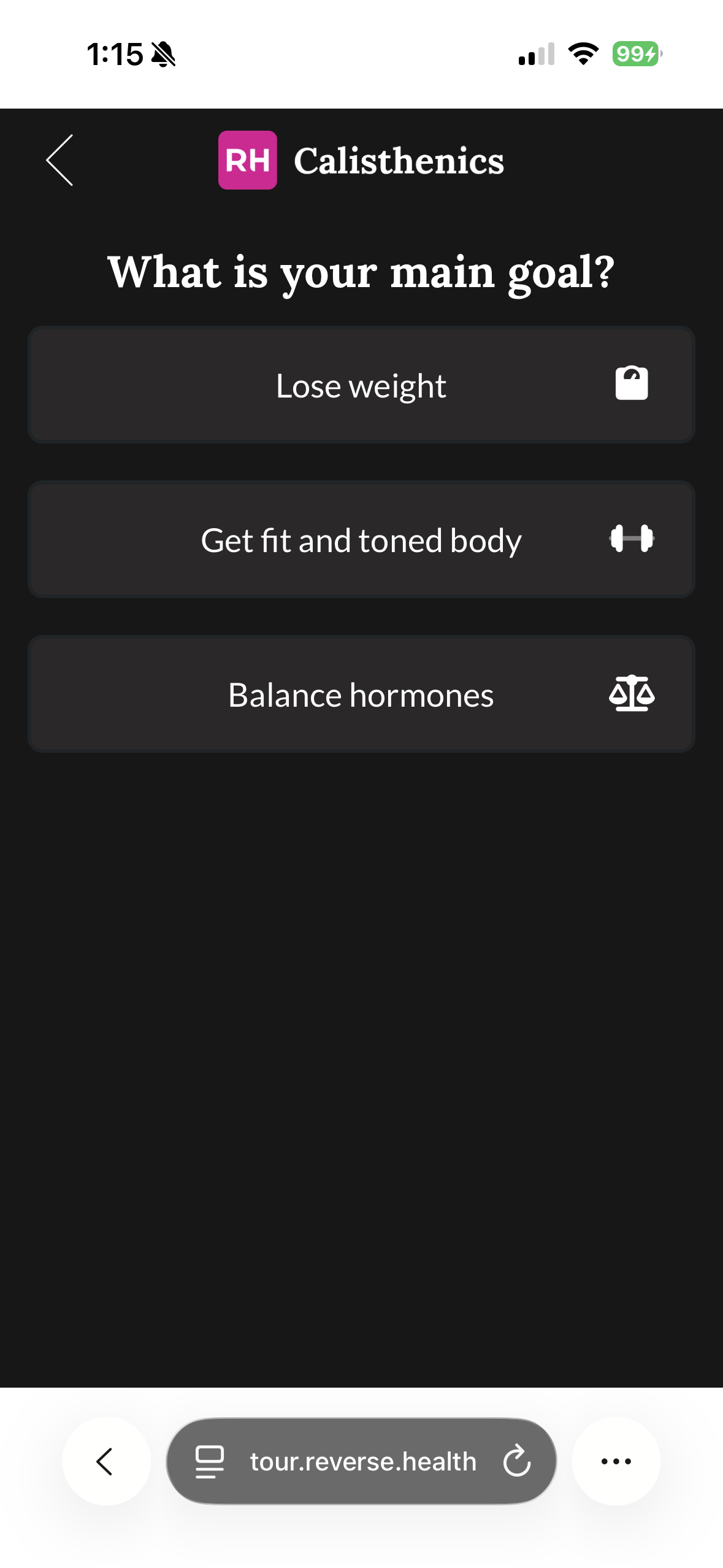
Consideration
Test a version with different content options, and add a "Help me choose the right goal" choice. Also reduce the number of steps before this question, so users reach their goal-setting moment sooner, while intent is still high.
Enter Email
This is the second biggest in funnel leak, and it's the worst possible place to lose people. At this point users can't yet see the value of the product, so asking for an email without explaining the benefit can feel like a marketing capture step rather than part of the personalized plan experience.
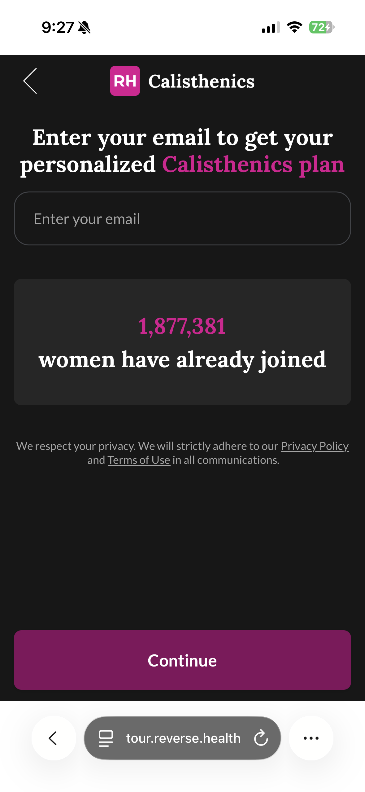
Consideration
Some users also sense the paywall coming. Handing over an email right before a likely payment ask makes the wall feel closer, so a chunk bail preemptively.
Design Proposal
The Enter Email step was selected for the design proposal based on its position as the second-largest in-funnel drop-off and one of the most critical moments to lose users. The main issue is a weak value exchange: users are asked to give their email and attention before clearly seeing what they will receive. As a result, the step feels more like lead capture than part of the personalized plan experience, and this is the proposed design solution.
Design direction
- The design fix focuses on strengthening the value exchange before asking for the user's email.
- Research shows users are more likely to complete a form when the request is tied to a clear reward.
- This version reframes the page around the user's selected main goal, such as weight loss, and uses outcome-based copy like “See my plan” instead of a generic “Continue.”
Low-effort test path
CMS-ready- Because the funnel is built in a templated CMS, I would treat the CTA, subtitle, trust message, and static page copy as parameterizable changes that can be tested without engineering.
- Based on that, I explored both a CTA variant and a content variant.
- The main exception is dynamically changing the headline across three different goals, which would likely require conditional logic or a new CMS variable.
Higher-effort version
Needs devConditional logic- If the CMS supports duplicated pages or static page variants, I would first test one goal-based version per segment without new development and route traffic to each version.
- If those variants improve email completion, then investing in a reusable dynamic personalization component would be easier to justify.
Extra: Improving email capture upstream
Reducing friction before the email step would improve email capture. Three directions were tested across content clarity, CTA framing, and the quiz-to-email flow.
Implementation Feasibility
To make the proposal more actionable, I mapped each direction by implementation effort and how easily it could be tested in the current setup.
Copy-only refinements
Update the CTA, subtitle, trust line, and supporting copy as parameterizable CMS fields. This is the lowest-effort path and the fastest way to validate whether stronger value framing lifts email completion.
Static goal-based variants
Create separate landing or email-step variants for different goals and rotate traffic through Everflow. This keeps testing lightweight while validating whether stronger goal specificity improves the value exchange.
Dynamic personalization
Pass the selected main goal into the email step and swap the headline or supporting content conditionally. This requires more setup, but it becomes more justified if static variants show that goal-based personalization materially improves conversion.
Sources
1. Nielsen Norman Group — "Progress Indicators Make a Slow System Less Insufferable"
Supports progress feedback reducing uncertainty and keeping users moving. Caveat: this NN/g piece is about system and wait-time progress, not multi-step counters, so it works best paired with the goal-gradient research below for the step-count point specifically.
2. Baymard Institute — "Checkout Flows Average 5 Steps and 11+ Form Fields"
Supports unifying questions over just splitting steps: the number of form fields users must manage matters more to checkout UX than the number of steps, and most flows can drop to 6 to 8 fields.
3. The Manifest — "6 Steps for Avoiding Online Form Abandonment"
Used for the stat that 27% of users abandon a form because it is too long, and once they abandon, they rarely return. Caveat: this is a 2018 survey of 502 people, so I treat it as dated.
The exact origin of the term "endowed progress effect": people given artificial advancement toward a goal show greater persistence toward reaching it.
Supports the claim that people accelerate effort as they get closer to a reward. I use this when I reference the goal-gradient effect.
6. IBM Carbon Design System — Progress indicator, usage guidelines
An authoritative design-system reference for showing users where they are: dividing the end goal into smaller subtasks increases the sense of completeness, and keeping users informed of where they are gives them a sense of control.
Used for the accessibility angle on the email field: home pages averaged 6.3 form inputs, and 34.2% of those inputs were not properly labeled. Note: the 48% figure floating around secondary sources is the share of homepages with at least one unlabeled input, which is a different metric.
8. HubSpot — "10 Form Conversion Optimization Tips"
From HubSpot's analysis of 40,000+ landing pages: buttons labeled "Submit" had lower conversion rates, and 3-field forms converted best with a drop-off after that. I use this for the "outcome copy beats continue" and "keep the ask minimal" points.
9. Reverse Health Calisthenics Funnel
Live Reverse Health calisthenics onboarding funnel used as the baseline reference for Task 3.
Live Muscle Booster onboarding flow referenced for the interstitial-screen pattern and quiz-to-plan structure.
11. Flo Health Quiz
Live Flo onboarding experience referenced for privacy reassurance and value-first signals before monetization.
Live Better Me wall pilates funnel referenced for the age gate, wellness-profile steps, and onboarding comparison.
13. The role of privacy assurance mechanisms in building trust
Research cited to support the idea that privacy and assurance cues can increase trust and willingness to disclose personal information online.
14. Consumer Willingness to Share Personal Digital Information for Health-Related Uses
Health-data sharing study referenced to support the role of trust and context in willingness to share personal information.
Trust-and-disclosure research referenced to support why reassurance can affect users' readiness to share information in a funnel.
Tools
Tags
More work
Other Projects
Self-Service Access and Role Management
Replaced a manual workflow with a centralized, self-managed platform; cutting processing time by 72%.
View case study →
Nayya Integration
Designed the integration of Nayya as an AI-powered benefits tool, guiding employees to choose coverage that matched their needs.
View case study →
Flock Accessibility Audit & Design System Unification
Led an accessibility audit and helped unify the design system. This reduced pattern debt, made the product more consistent, and improved collaboration between design and development teams.
View case study →