Accessibility / Design Systems
Flock Accessibility Audit & Design System Unification
Led an accessibility audit and helped unify the design system. This reduced pattern debt, made the product more consistent, and improved collaboration between design and development teams.
Year
2025
Role
Product Designer
Client
Paychex via ITX Corp
Overview
Structure
My Role
- Accessibility Audit Lead
- Component Strategy
- Design Systems
- Engineering Partnership
Tools Used
- Figma
- Jira
- Miro
Timeline
6 months audit + 1 year build
Case Study
The problem
The lack of a design system meant icons, typography, dialogs, repeated interface patterns, inconsistent component behavior, and reusable UI patterns had drifted over time.
That created friction for implementation, affected accessibility readiness, made handoffs less reliable, and increased the cost of maintaining consistency in the experience.
Context
My role was to turn accessibility findings and UI inconsistencies into a clear system direction to define reusable patterns that design and engineering could adopt.
The product had been recently acquired, so the goal was to keep its visual identity while improving consistency and usability through a more scalable, React-based system.
Success meant reducing duplicated patterns, improving the product, clarifying handoff expectations, and creating stronger accessibility guidance for future work.
6 months
Audit and prioritization
initial accessibility and system review
1 system
Shared foundation
aligned patterns, typography, icons, and dialogs
Methodology
Audit to Systemization
1. Audit
Checked for accessibility issues and components that didn't match the system.
2. Structure
Grouped problems by importance to see what to fix first.
3. Systemize
Created clear patterns, states, and rules for how components should work.
4. Align
Worked with developers to make sure designs could be built correctly in React.
5. Validate
Reviewed designs and builds, using feedback to improve consistency.
Research & discovery
Accessibility Audit
Existing Confluence documentation and the product were reviewed to identify missing patterns and determine which could be retained within the new library structure.
Issues were organized by severity, system impact, and implementation complexity, while distinguishing between accessibility gaps and system inconsistencies.
Audit findings were translated into reusable system guidance by separating accessibility issues from pattern decisions and documenting expected component behavior.
Accessibility checks were conducted using Axe and VoiceOver to analyze issues across desktop and mobile.

Open image to zoom
Before & After Accessibility Updates
Each example below shows how the same product patterns were reworked to improve hierarchy, navigation, controls, and clarity without relying on the original branded UI.
Checklist Applied
Color & Typography
The audit found low-contrast surfaces, weak hierarchy, and inconsistent heading treatment across pages.
Before
General
settings
Supporting text blended into the background and the heading scale did not create a reliable reading order.
Status
Review
Owner
Operations
After
System settings
A stronger type scale, darker body copy, and clearer supporting labels created a more readable baseline for every screen.
Status
Review
Owner
Operations
Requirements met
Contrast: All text, UI elements, and graphics meet minimum contrast ratios and remain readable in all states.
Color Usage: Color is not the only way to convey information; additional cues (icons, labels, states) are used.
Focus & States: Interactive elements have clear, visible focus states that are distinct from hover and other states.
Checklist Applied
Layout & Navigation
Navigation patterns and page structure drifted between modules, making the product feel less predictable.
Before
Home
Reports
Settings
Users
After
Home
Reports
Settings
Users
Requirements met
Reading Order: Content follows a clear, logical order, ensuring proper reading and navigation for all users, including screen readers.
Tables: Data tables are simplified, avoid complex structures, and include clear captions.
Navigation Consistency: Navigation is consistent across pages, making it easier to learn and use.
Navigation States: All navigation elements include clear states (default, hover, active, focus, and selected) to indicate interaction and location.
Checklist Applied
Links & Buttons
Interactive controls used mixed visual rules, so priority and affordance were not always obvious.
Before
Controls looked related, but visual priority and focus behavior were not clearly differentiated.
After
Action hierarchy, hover affordance, and focus visibility were standardized to make interactions easier to interpret and test.
Requirements met
Links vs Buttons: Links are used for navigation (URL change or focus shift); buttons are used for actions.
Link & Button Text: Labels are clear, descriptive, and concise. Avoid vague text and indicate external links when needed.
Contrast: Links and buttons meet contrast requirements, including text, background, and borders, and are clearly distinguishable as interactive elements.
Target Size: Clickable elements meet minimum size requirements (24×24 CSS px) where applicable.
Checklist Applied
Forms & Controls
Form fields, inline feedback, and changeable content lacked enough structure to support accessibility and QA.
Before
No persistent label, helper text, or validation context.
Error
Inline updates and control state changes were easy to miss.
After
Name and last name
Users can enter their first and last name in clearly separated fields.
Email address
Used for account recovery and system alerts.
Validation error
Enter a valid email address to continue.
Changes saved. Filters and validation now use persistent status messaging.
Requirements met
Forms & Controls: Inputs, labels, and controls are clear, visible, and placed close together. All states (active, focus, hover) are defined.
Error & Status Messages: Users receive clear feedback for actions, errors, and system states. Messages are placed correctly and provide enough guidance to fix issues.
Dynamic Content: Interactive content (audio, video, UI elements) is accessible via keyboard and meets contrast and state requirements.
Motion & Animation: Animations follow accessibility guidelines, avoid unnecessary motion, and include options to reduce or stop movement.
Design Proposal

Clarify foundations, components, patterns, and modules so teams know when to use each pattern and how it should behave.
Separated accessibility fixes from design-system decisions by documenting patterns, variants, states, and usage rules.
Worked closely with developers to adapt component decisions to implementation realities, QA needs, and handoff clarity.
Used design review, accessibility checks, and implementation feedback to strengthen adoption and consistency.
The Solution
Consistency: Reusable components (buttons, headers, fonts, etc.) ensure a uniform design across the project, making it easier for developers to match the final product to the design.
Faster Updates: When a component is updated, all instances automatically adjust, keeping designers and developers aligned without manual revisions.
Design Systems: Components are part of a design system, providing clear guidelines for both teams and reducing errors in implementation.
Auto Layout & Constraints: Designers can use auto layout to create responsive components, which developers can easily translate into code for different screen sizes.

Results & Impact
Compliance issues across existing pages.
Approved accessibility standards (Level A, Level AA) and a clearer standardization path.
Fragmented and duplicated patterns.
Unified shared library direction.
Weak handoff and limited reusable components.
Documented information to create alignment and clearer implementation support.
Learnings
Usability is about revealing what matters. Usability isn't about removing; it's about revealing what matters. This project proves that accessibility, performance, and UX all strengthen each other when treated as one discipline.


Tools
Tags
More work
Other Projects

Enhancing Benefits Enrollment
Replaced a manual workflow with a centralized, self-managed platform; cutting processing time by 72%.
View case study →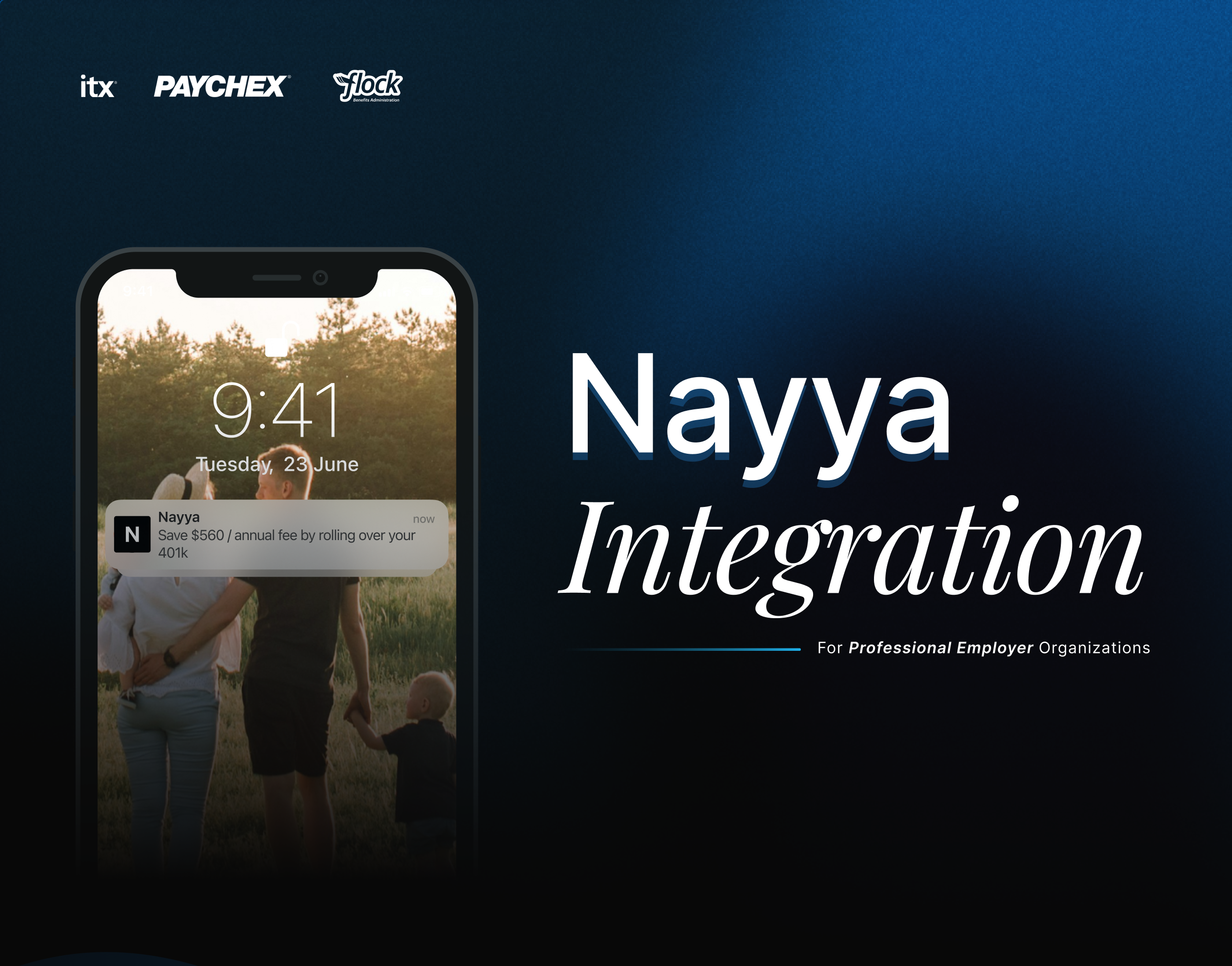
Nayya Integration
Designed the integration of Nayya as an AI-powered benefits tool, guiding employees to choose coverage that matched their needs.
View case study →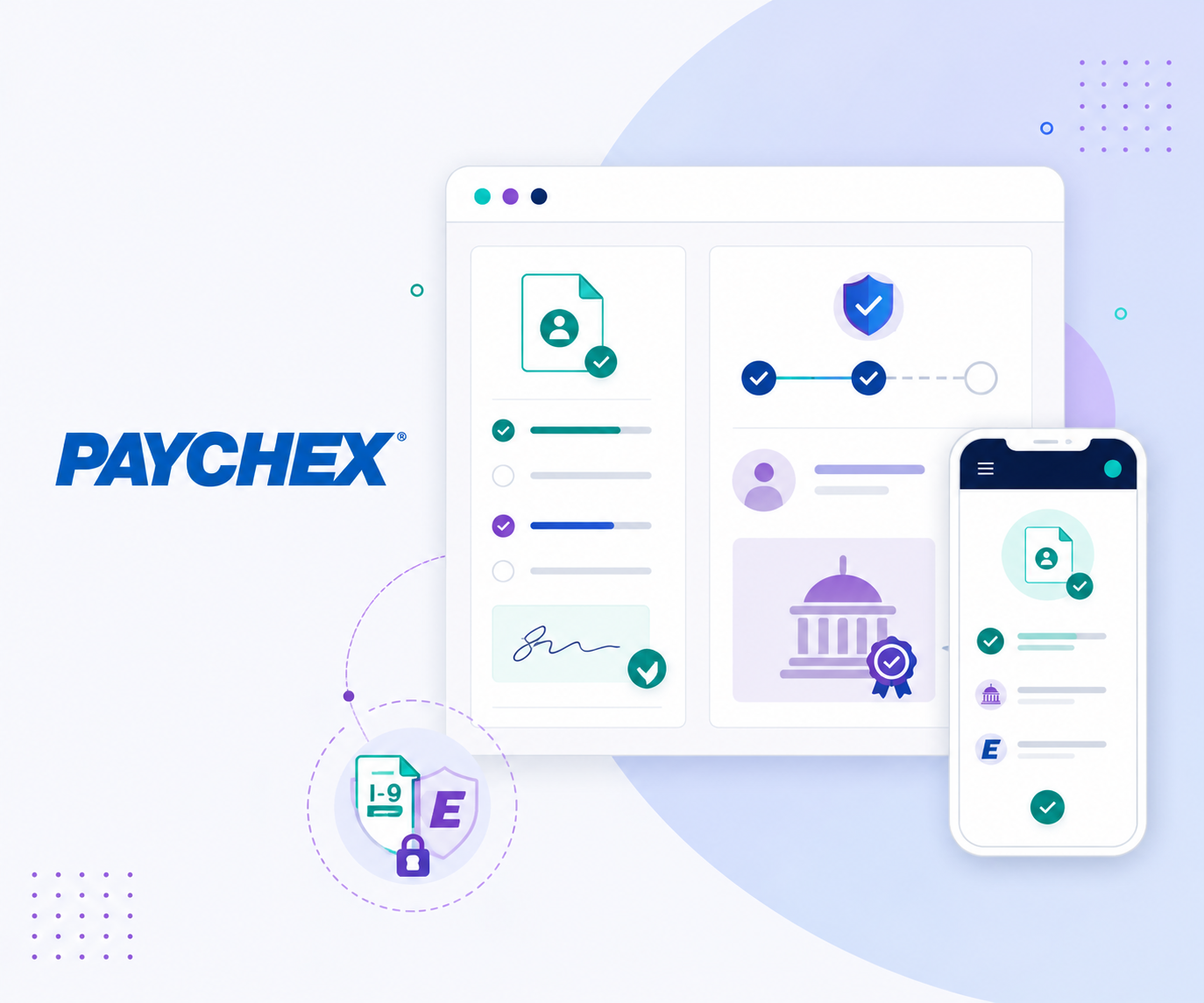
I-9 & E-Verify Integration for Flex
Integrated I-9 and E-Verify into Flex onboarding, improving task completion by 12% and user confidence from 3.2 to 4.0.
View case study →