Education / Performance Marketing
Paid Traffic Funnel Redesign
Across three campaign variants, the funnel generated 1.04M reach, 14,885 purchases, and a blended $1.79 cost per result on $26.6K spend.
Year
2025
Role
Sr. Product Designer
Client
Zapiano
1.04M
Reach across all campaign variants
14,885
Purchases recorded across the test snapshot
$1.79
Blended cost per result
Overview
Structure
My Role
- Sr. Product Designer
- Design
- Research
- Strategy
Tools Used
- Figma
- ClickUp
- Microsoft Copilot
- Google Analytics
- Meta Ads Manager
Timeline
2 to 3 months
Case Study
The problem
Zapiano is a Swiss online piano course platform for adults, founded by piano teacher Sven Haefliger. Meta campaigns were driving healthy reach (1.04M reach, 2.85M impressions), but paid landing conversion was stuck at 6% and most visitors bounced before any conversion event.
The existing page led with three Club subscription tiers side-by-side, dense feature blocks, and three competing CTAs. Cold traffic hit the highest-priced tier within the first scroll and left.
Context
Lift paid landing conversion and reduce CAC while working within two real constraints.
The site runs on Kajabi, so any redesign had to be modular and assemblable from existing content blocks. No custom engineering per variant.
The page had to serve two distinct user types Marketing identified in the ad funnel: complete beginners and adults returning to piano after years away. Same product, different motivations, same landing page.
The goal Marketing handed me was simple: more conversions, lower cost per acquisition, same ad spend.
Success Metrics
- Increase paid landing conversion without increasing ad spend.
- Reduce CAC enough to make scale more efficient.
- Create a modular Kajabi page structure Marketing can keep testing post-launch.
6.0%
conversion rate on the original control campaign
$4.20
cost per purchase before the redesign and experiment
2,847
purchases generated by the baseline control variant
Methodology
Paid Funnel Redesign Sprint
1. Audit the funnel
2. Benchmark the category
3. Reframe the landing
4. Build modular components
5. A/B test social proof
Audit the funnel
Mapped Meta campaign data against Google Analytics flow reports to locate the drop-off. The pattern was clear: visitors scrolled past the hero, hit the EUR5220 Gold tier within seconds, and exited. The page was answering the wrong question first: is this about years of cost, or whether this is for me and how I start?
Funnel architecture | Before vs After
The strategic reframe: from a 3-tier upfront decision to a stepped, low-friction entry that mirrors daily practice
Cold paid traffic asked to choose a 1-year, 2-year, or 5-year commitment within seconds of landing.
Top of funnel
Meta Ad
~1.77M reach | 5.84M impressions across the test period
Landing page
Zapiano Club LP
All 3 tiers presented side-by-side. Dense feature blocks. Three competing CTAs.
Purchase decision
3-tier choice
Bronze (EUR365) | Silver (multi-year savings) | Gold (5-year commitment)
Outcome
Subscription (or bounce)
Most cold visitors bounced before this point.
A EUR9 first action lowers the cost of saying yes. The big decision moves to a warmer point in the funnel.
Top of funnel
Meta Ad
Same campaigns, same spend, same audiences
Landing page
EUR9 Intro Course LP
Sven leads hero. Beginner / returner segmentation. Single CTA. Community proof in fold.
First purchase
EUR9 Intro Course
One-time, transactional, low-friction. A clear first step that maps to daily practice.
Warm upsell
PianoStarter EUR29/month
Recurring subscription offered after the user has experienced the product. Decision happens warm, not cold.
Benchmark the category
Before sketching anything, I audited five direct competitors against seven conversion heuristics that matter for cold paid traffic. The pattern was clear: Zapiano was the weakest landing in the category on every dimension that drives entry conversion.
Competitive benchmark
Adult piano learning category | 5 competitors evaluated across 7 UX and conversion heuristics
| Product | Low-friction entry offer | Beginner vs returner path | Founder credibility upfront | Community proof on page | Pricing clarity | Mobile-first clarity | CTA visibility & clarity | Key takeaway for Zapiano | |
|---|---|---|---|---|---|---|---|---|---|
| Direct competitors | |||||||||
Simply Piano hellosimply.com | ✓ | ✓ | ✗ | ~ | ✓ | ✓ | ✓ | 7-day free trial sets category baseline. Onboarding quiz segments by level. | |
Skoove skoove.com | ✓ | ~ | ✗ | ✗ | ✓ | ✓ | ✓ | Free tier as entry hook. Skips segmentation, treats all visitors as beginners. | |
Flowkey flowkey.com | ✓ | ✓ | ✗ | ✗ | ✓ | ✓ | ✓ | Strong hero video. Beginner / intermediate / returner paths clearly labeled. | |
Yousician yousician.com | ✓ | ✓ | ✗ | ~ | ~ | ✓ | ✓ | 10M+ user social proof. Pricing transparency criticized in user reviews. | |
Pianote pianote.com | ✓ | ✓ | ✓ | ✓ | ✓ | ✓ | ✓ | Category gold standard. Real teachers in hero, community is core value prop. | |
| Zapiano | |||||||||
ZapianoBefore zapiano.com (original LP) | ✗ | ✗ | ✗ | ~ | ✗ | ~ | ✗ | - High upfront cost - Competing membership tiers - No audience segmentation before users understood the value | |
ZapianoAfter zapiano.com (redesign) | ✓ | ✓ | ✓ | ✓ | ✓ | ✓ | ✓ | €9 intro course as paid entry. Beginner / returner path. Sven leads hero. Community block in fold. | |
Direct competitors
Simply Piano
hellosimply.com
Low-friction entry offer
Strong
Beginner vs returner path
Strong
Founder credibility upfront
Missing
Community proof on page
Partial
Pricing clarity
Strong
Mobile-first clarity
Strong
CTA visibility & clarity
Strong
Key takeaway
7-day free trial sets category baseline. Onboarding quiz segments by level.
Skoove
skoove.com
Low-friction entry offer
Strong
Beginner vs returner path
Partial
Founder credibility upfront
Missing
Community proof on page
Missing
Pricing clarity
Strong
Mobile-first clarity
Strong
CTA visibility & clarity
Strong
Key takeaway
Free tier as entry hook. Skips segmentation, treats all visitors as beginners.
Flowkey
flowkey.com
Low-friction entry offer
Strong
Beginner vs returner path
Strong
Founder credibility upfront
Missing
Community proof on page
Missing
Pricing clarity
Strong
Mobile-first clarity
Strong
CTA visibility & clarity
Strong
Key takeaway
Strong hero video. Beginner / intermediate / returner paths clearly labeled.
Yousician
yousician.com
Low-friction entry offer
Strong
Beginner vs returner path
Strong
Founder credibility upfront
Missing
Community proof on page
Partial
Pricing clarity
Partial
Mobile-first clarity
Strong
CTA visibility & clarity
Strong
Key takeaway
10M+ user social proof. Pricing transparency criticized in user reviews.
Pianote
pianote.com
Low-friction entry offer
Strong
Beginner vs returner path
Strong
Founder credibility upfront
Strong
Community proof on page
Strong
Pricing clarity
Strong
Mobile-first clarity
Strong
CTA visibility & clarity
Strong
Key takeaway
Category gold standard. Real teachers in hero, community is core value prop.
Zapiano
ZapianoBefore
zapiano.com (original LP)
Low-friction entry offer
Missing
Beginner vs returner path
Missing
Founder credibility upfront
Missing
Community proof on page
Partial
Pricing clarity
Missing
Mobile-first clarity
Partial
CTA visibility & clarity
Missing
Key takeaway
- High upfront cost
- Competing membership tiers
- No audience segmentation before users understood the value
ZapianoAfter
zapiano.com (redesign)
Low-friction entry offer
Strong
Beginner vs returner path
Strong
Founder credibility upfront
Strong
Community proof on page
Strong
Pricing clarity
Strong
Mobile-first clarity
Strong
CTA visibility & clarity
Strong
Key takeaway
€9 intro course as paid entry. Beginner / returner path. Sven leads hero. Community block in fold.
The redesign brief wrote itself: close the four critical gaps of entry friction, segmentation, founder visibility, and community proof while keeping what was already working, including risk reversal and content depth.
Reframe the landing
The Club tiers were the real conversion blocker, so I recommended killing them as the cold-traffic entry, leading with the €9 Introduction Course, and upselling to PianoStarter at €29/month after the intro.
Users did not need three options to compare, they needed one clear next thing to do. The team approved the change, and I redesigned the landing around the new entry:
- beginner vs returner segmentation
- one primary CTA for the €9 intro
- email gate below social proof
- community credibility in the fold instead of three competing pricing blocks

Build modular components

The redesign combined a funnel audit, competitor benchmark, offer reframe, modular landing-page redesign, and post-launch testing. Reduce the cognitive cost of the first yes by leading with a single low-friction paid entry instead of multiple long-term commitments.
Make founder credibility, beginner-vs-returner relevance, and community proof visible early enough to help cold traffic orient before price friction hits. Design the page as a modular no-code system Marketing could keep testing inside Kajabi without needing engineering for every iteration.
A/B test social proof
Variant A used physical community proof through annual Zapiano member meetup photos in Switzerland and Germany. Variant B used digital community proof through mobile app screenshots, member feed views, and in-product social proof.
A/B testing comparison
Same offer, same audience, two different social proof treatments.
| Difference | Variant A | Variant B | Why it mattered |
|---|---|---|---|
| Social proof treatment | Physical community proof | Digital community proof | The test isolated proof format, not the offer. |
| Creative used | Annual Zapiano member meetup photos in Switzerland and Germany | Mobile app screenshots, member feed views, and in-product social proof | Variant B made the product itself visible much earlier. |
| Audience signal | Warm, authentic, but implied in-person participation | Immediate, tangible preview for cold, mobile-first visitors | Cold paid traffic responded better to product tangibility than community warmth. |
| Conversion outcome | Lower-performing variant | Winning variantWinner | Variant B won decisively and became the rollout direction. |
Social proof treatment
Variant A
Physical community proof
Variant B
Digital community proof
Why it mattered
The test isolated proof format, not the offer.
Creative used
Variant A
Annual Zapiano member meetup photos in Switzerland and Germany
Variant B
Mobile app screenshots, member feed views, and in-product social proof
Why it mattered
Variant B made the product itself visible much earlier.
Audience signal
Variant A
Warm, authentic, but implied in-person participation
Variant B
Immediate, tangible preview for cold, mobile-first visitors
Why it mattered
Cold paid traffic responded better to product tangibility than community warmth.
Conversion outcome
Variant A
Lower-performing variant
Variant B
Winning variantWinner
Why it mattered
Variant B won decisively and became the rollout direction.
Once both variants had statistically meaningful data, I used Copilot to compare scroll depth, time-to-CTA, and segment behavior across variants. It compressed the slowest part of the testing cycle, synthesis, without replacing the design judgment that came before it.
Results & Impact
$26,568.50
Amount Spent
~5.0x
Return on Ad Spend (ROAS)
14,885
Purchases
~$0.25
Cost per Click (CPC)
$1.79
Cost per Result (CPR)
1.04M
Reach
2.85M
Impressions
Enrollment Behavior Insights
- Variant B won decisively because mobile app screenshots gave cold visitors a tangible preview of what they were buying.
- The meetup photos in Variant A were warmer and more authentic, but they implicitly required showing up in person, a commitment cold visitors were not ready to make.
- The lift did not come from visual polish alone. It came from reordering the decision the page asked users to make.
Opportunities and Next Steps
- Personalized hero copy based on ad creative so beginner ads route to a beginner hero and returner ads route to a returner hero.
- A pre-paywall qualifier quiz with 3-4 questions on goals and level to lift intro-to-subscription conversion further down the funnel.
- AI-generated copy variants for headline A/B testing at scale.
Projected Improvements
- Conservative 1-month scenario: with a 5,500 to 6,000 media budget and using the blended dashboard CPR of $1.79 rather than the winning-variant low of $0.85, the campaign would project roughly 3,070 to 3,350 intro-course purchases.
- At a €9 entry ticket, that implies about €27.6K to €30.2K in top-of-funnel revenue before any PianoStarter upsell or downstream LTV is counted.
- Using the preserved dashboard delivery ratios as a baseline, that same budget range would conservatively translate to roughly 215K to 235K people reached and about 590K to 645K impressions over one month.
- Primary markets worked in this setup: Germany, Switzerland, Sweden, and the Netherlands.
- Recommended targeting mix for a conservative next-month run: broad Advantage+ / algorithmic cold audiences for scale, piano-learning and adult-beginner interest clusters for control, plus warm retargeting from site visitors or CRM / first-party lists when available.
- Estimated audience size by targeting type: broad Advantage+ cold audiences in these four markets can usually support a combined reachable pool in the low millions, interest-based pools are typically narrower but still large enough for monthly testing, and first-party / retargeting pools depend on site traffic and database volume.
Conservative 1-Month Scenario
Budget
$5,500
Reach
~216K
Purchases
~3,073
Revenue
~€27.7K
Budget
$6,000
Reach
~236K
Purchases
~3,352
Revenue
~€30.2K
Learnings
The bottleneck was the offer, not the UI. The Club tier setup was not a UI problem. It was an offer problem dressed up as a layout problem. The biggest conversion lift came from changing what visitors were being asked to decide.
Cold traffic needs a low-cognitive first step. On cold paid traffic, the landing page's first job is not to sell everything. It is to lower the cognitive cost of saying yes. The EUR9 intro offer did that far better than a multi-tier subscription choice.
Proof type matters as much as proof volume. Variant B won because the mobile app screenshots gave cold visitors a tangible preview of what they were buying. The meetup photos in Variant A were warmer, but they implied a commitment visitors were not ready to make yet.
Tools
Tags
More work
Other Projects
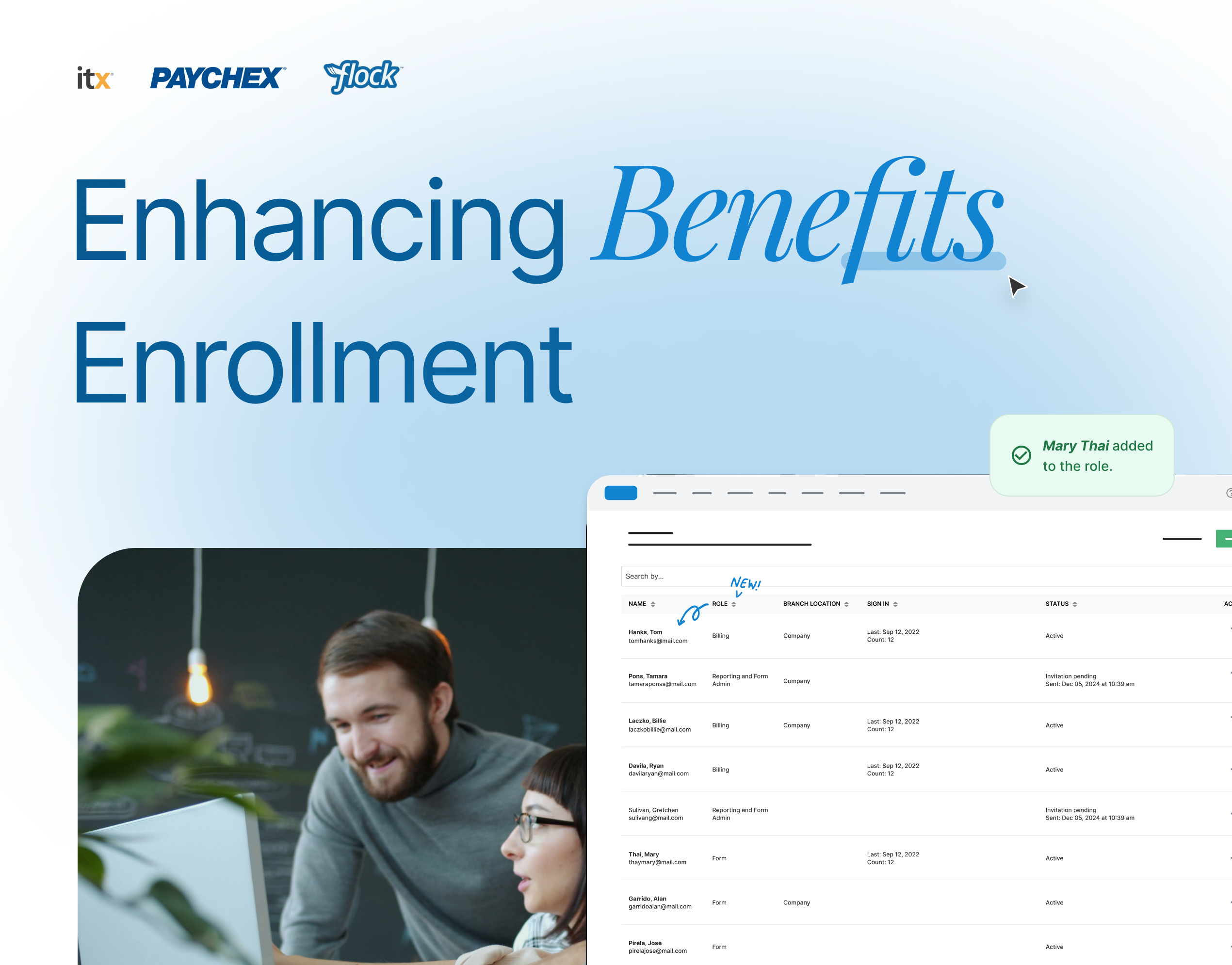
Enhancing Benefits Enrollment
Replaced a manual workflow with a centralized, self-managed platform; cutting processing time by 72%.
View case study →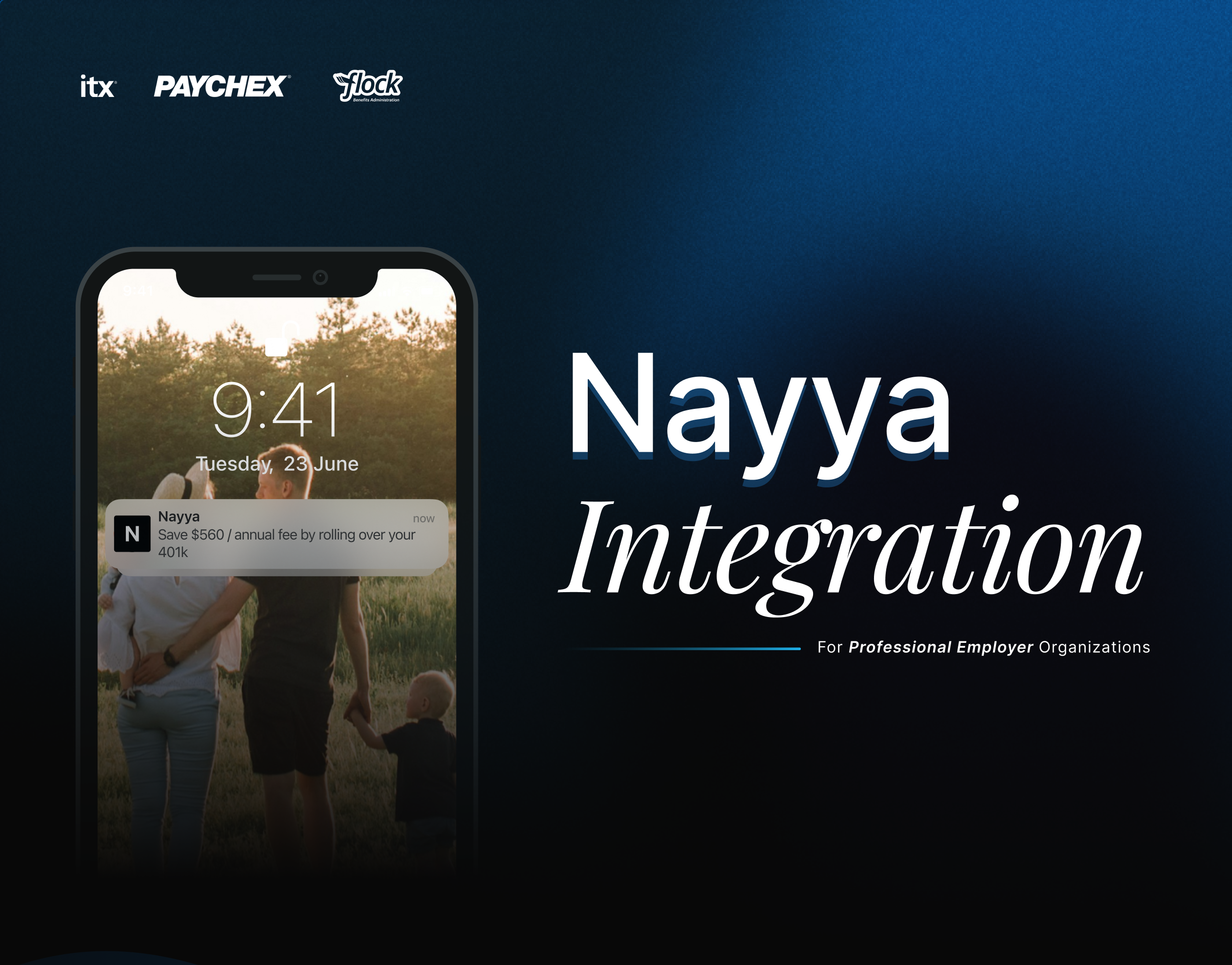
Nayya Integration
Designed the integration of Nayya as an AI-powered benefits tool, guiding employees to choose coverage that matched their needs.
View case study →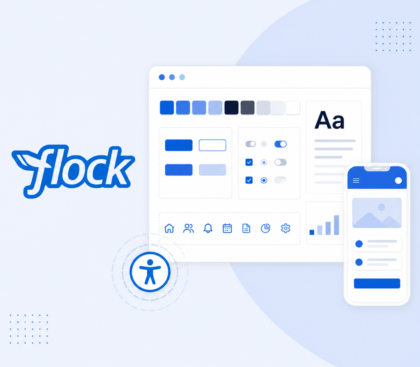
Flock Accessibility Audit & Design System Unification
Led an accessibility audit and helped unify the design system. This reduced pattern debt, made the product more consistent, and improved collaboration between design and development teams.
View case study →