Capture
Capture audience needs, objections, and the service model.
Gemini NotebookLM
Insurance / Advisory
Designed an insurance-awareness campaign and conversion path that turns social-media reach into direct WhatsApp inquiries and qualified consultation opportunities.
Year
2026
Role
Design Engineer
Client
Protecta Advisory
72%
Faster website delivery
AI-assisted workflow across brand, bilingual content, website design and build, QA, and launch.
98%
New-audience reach
Views from non-followers in the first 28 days of the campaign.
WCAG 2.1 AA
Accessibility target
Component-level accessibility checks were handled in Storybook during the build.
Overview
My Role
Tools Used
Timeline
72% faster website delivery
Case Study
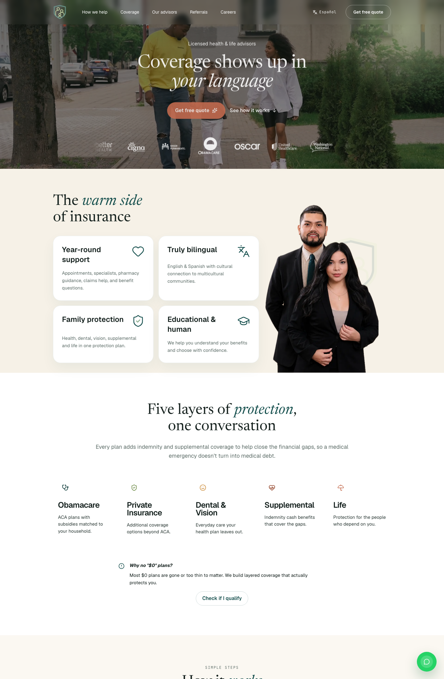
Protecta is an independent health and life insurance advisory serving multicultural US families in English and Spanish. Their value is human-led, year-round guidance, the opposite of the call-center feeling common in the category.
They already had strong word-of-mouth momentum and a referral model that pays cash incentives, but they had no brand system, no website, and no content architecture to explain that value clearly online.
Context
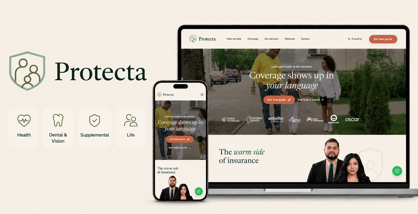
Deliver a full branded bilingual website, including homepage, internal pages, content strategy, brand system, component structure, accessibility QA, and live deployment.
The site needed to explain the referral program, communicate trust quickly, and give prospects a low-friction path to contact the advisors through WhatsApp.
AI alignment
I structured the work as an AI-augmented production pipeline with human judgment at each handoff. Claude and NotebookLM accelerated ideation, research synthesis, and first-draft copy.
Claude Design created the initial visual direction; I then selected, structured, and iterated the strongest ideas from the analysis. Codex and Claude Code accelerated the build, and Storybook acted as the component documentation and accessibility QA layer.
Research
I grounded the work in the 2026 Hispanic Insurance Growth Blueprint, client questionnaire, and advisor interviews—focusing on ACA, life, and digital acquisition. Advisor input surfaced recurring objections, trust concerns, and family questions.
AI accelerated research synthesis, working definitions, and analysis of bilingual patterns and positioning gaps. I turned those insights into campaign decisions across audience, message, channels, and measurement, validated outputs against source material, and made the final brand and product calls.
Open Notebook research ↗Methodology
AI expanded the option set; I set the criteria. At every stage, I evaluated outputs against source research, bilingual user needs, brand trust, business goals, feasibility, and accessibility—then selected the direction and made the final call.
Capture
Capture audience needs, objections, and the service model.
Research
Map bilingual patterns and positioning opportunities.
Brand
Create and refine a usable visual system.
Write
Shape clear English and Spanish messaging.
Design
Turn the strategy into page and component blueprints.
Build
Ship the production-ready website.
Validate
Check accessibility and prepare the launch.
Design Proposal
The brand guide translated Protecta's advisor-led promise into a premium, emotionally warm system. Claude Design accelerated visual exploration; research into family trust, bilingual expectations, and the advisor model shaped the final direction, hierarchy, and usability decisions.

Imagotype

Pine isotype
White isotype
Typography
Newsreader
Warm editorial display and headlines
Geist
Clear, modern body and UI text
JetBrains Mono
Eyebrows, labels, and data
Website type scale
Color palette
Warm, credible, and human - not generic insurtech.
Deep pine
#154F4D
Soft sage
#CFE3AD
Cream
#FDFCFE
Clay
#D96C4B
Honey
#E6BE63
Voice
A trusted advisor at the kitchen table: educate first, sell second, and avoid hype or fear-based language.
Bilingual by design
English and Spanish are equal citizens of the experience, built for cultural fluency rather than literal translation.
Visual behavior
Pine and cream create the base; clay and honey stay deliberate accents. Photography uses natural light, real families, and rounded corners.
Component library
I built the reusable interface in code with AI-assisted implementation, then documented its patterns and states in Storybook. This created a practical reference for consistent bilingual reuse, accessibility review, and future iteration.
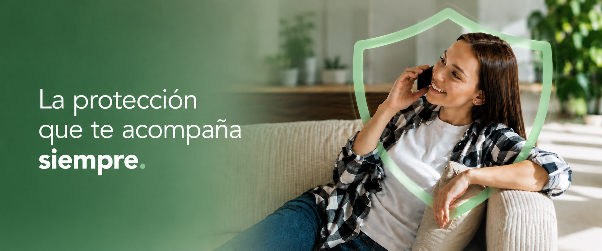
Research on trust barriers, recurring family questions, and bilingual needs shaped a Facebook and Instagram campaign built to generate qualified advisor leads. Each calm, family-centered post translated a coverage question into a clear reason to visit the website, learn more, and contact an advisor.
Make U.S. health coverage easier to understand.
Connect annual checkups to everyday coverage.
Show families where to turn after hours.
Link school preparation to included benefits.
Make required vaccines a clear coverage next step.
AI collaboration model
The 2026 Insurance Growth Blueprint was the decision foundation. I built task-specific agents to synthesize research, create working definitions, and challenge the work from each needed perspective: project manager, client stakeholder, researcher, content strategist, engineer, and QA reviewer.
AI accelerated synthesis and role-based critique; I evaluated its output against source research and remained accountable for the decisions, trade-offs, and final product.
PM agent
Clarified scope, priorities, dependencies, and delivery risks.
Stakeholder agent
Pressure-tested decisions against client goals, trust, and business needs.
Craft agents
Accelerated research synthesis, content drafts, implementation, and QA checks.
Launch stack
NotebookLM · Research synthesis
Claude Design · First visual direction
ChatGPT · Working definitions + copy
Codex · Implementation support
GitHub · Version control
Vercel · Live deployment
Storybook · Component documentation + QA
Practical implications
Claude Design made early directions faster to generate and compare. The constraint was no longer producing screens; it was evaluating NotebookLM research, choosing the strongest direction, and refining it with intent.
The interface was designed and validated in the live product. Codex accelerated implementation, while GitHub and Vercel supported a code-first delivery path. Storybook documents the reusable patterns and states that the code established.
The first visual draft came from Claude Design, then I iterated on each section with my own ideas and research-led judgment to strengthen the structure in code.
Key learnings
Starting in code created a system based on real bilingual pages, responsive behavior, and conversion paths. Each reusable pattern earned its place by solving a need in the product.
AI was most useful when guided by source research, working definitions, brand guardrails, and a defined role. It accelerated exploration and critique; it did not replace product judgment.
English and Spanish needed independent messaging choices to remain clear, credible, and natural for the families Protecta serves.
Documenting patterns in Storybook made it easier to review states, mobile behavior, and language variations before launch.
Measured impact
The campaign was designed to do more than build awareness. It created a direct path from social-media discovery to a personal conversation, helping potential customers move from interest to a qualified insurance consultation.
Campaign impressions
Results
100,000
Conversion
—
Unique reach
Results
77,000 people
Conversion
Average frequency: 1.3
Link clicks / landing-page visits
Results
1,000
Conversion
1.0% click-through rate
WhatsApp inquiries started
Results
120
Conversion
12% of landing-page visitors
Qualified leads
Results
40
Conversion
33% of WhatsApp inquiries
Consultations booked
Results
10
Conversion
25% of qualified leads
New customers or policies
Results
3
Conversion
30% of consultations
The campaign converted awareness into a measurable conversation path:
100,000 impressions → 1,000 landing-page visits → 120 WhatsApp inquiries → 40 qualified leads → 10 consultations → 3 new customers
By making WhatsApp the primary call to action, the experience reduced the effort required to ask questions, understand coverage options, and speak directly with an advisor. This gave Protecta a more useful measure of campaign value than reach alone: qualified demand and consultation opportunities.
Measurement note: This is a benchmark-based model using a 1.0% click-through rate and estimated conversion rates through the inquiry and consultation journey.
AI is best at compression, not authorship. The biggest gain came from compressing research synthesis, first-draft copy, and code scaffolding. Brand judgment, hierarchy, and trust signals still needed a designer making the calls.
Localization is a design decision. The Spanish experience needed cultural adaptation, not literal translation. That changed tone, phrasing, and how reassurance showed up in the interface.
A live product changes review quality. Showing the client a working site instead of frames made feedback faster and more grounded because they evaluated the real experience rather than imagining it.
Tools
Tags
More work
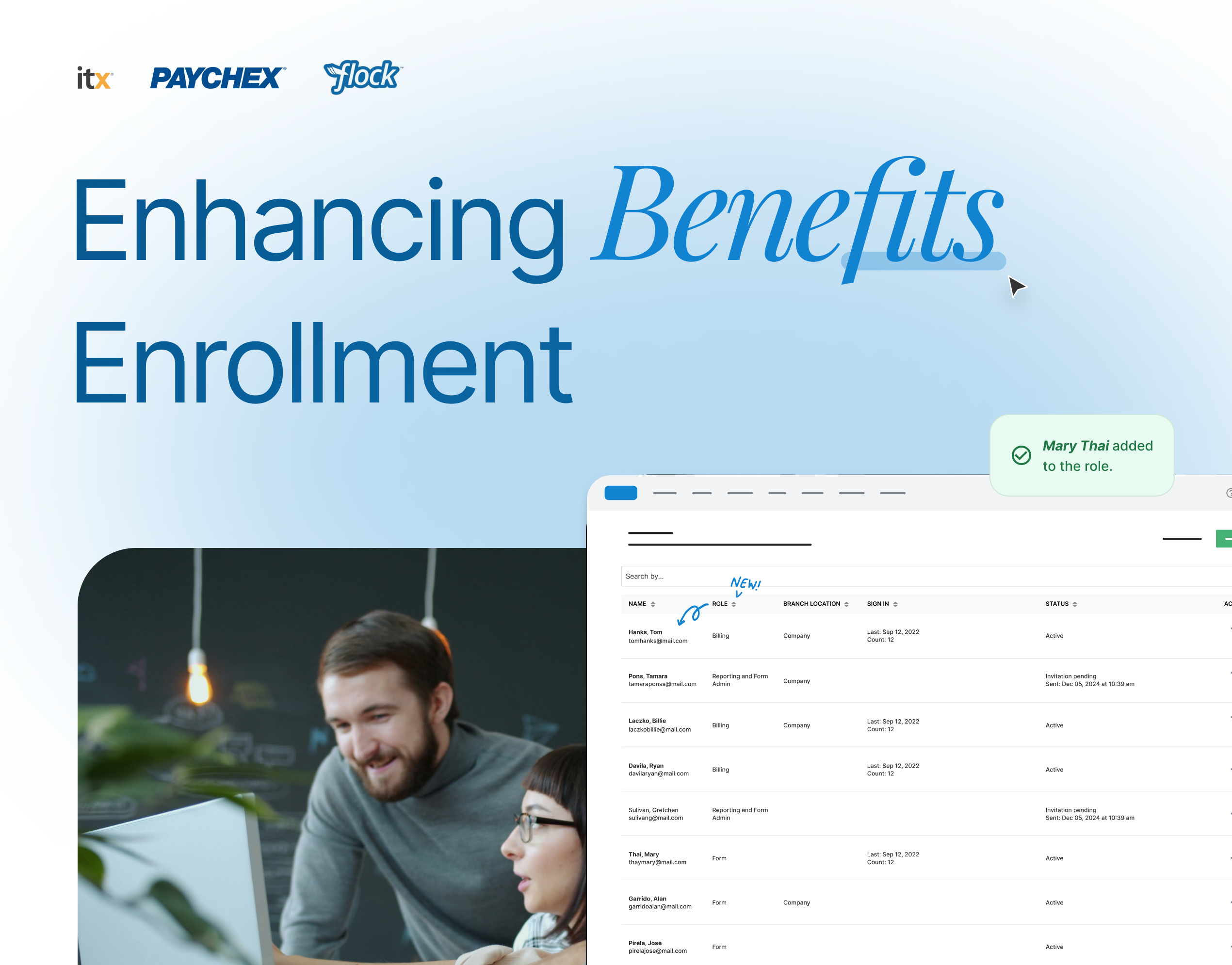
Replaced a manual workflow with a centralized, self-managed platform; cutting processing time by 72%.
View case study →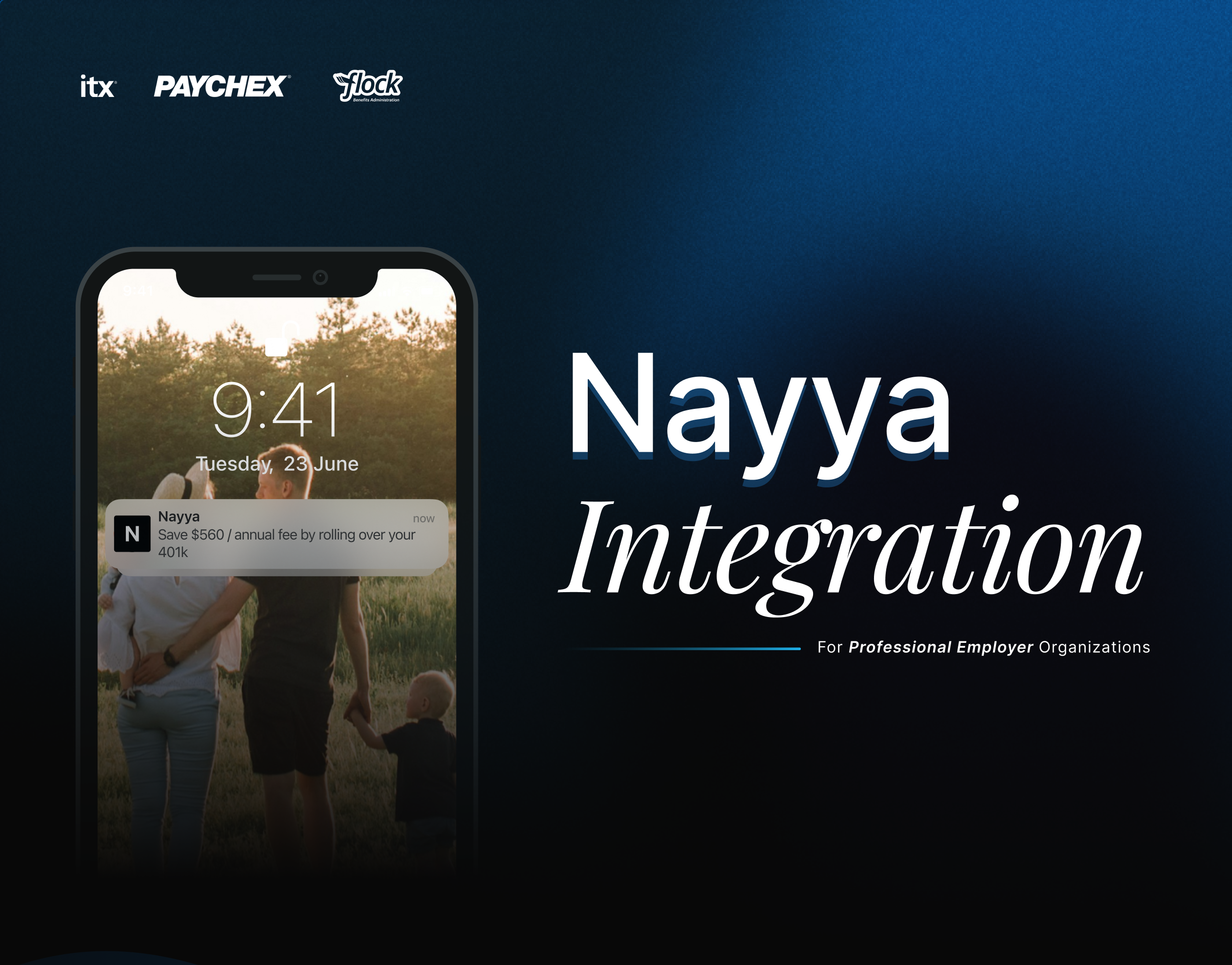
Designed the integration of Nayya as an AI-powered benefits tool, guiding employees to choose coverage that matched their needs.
View case study →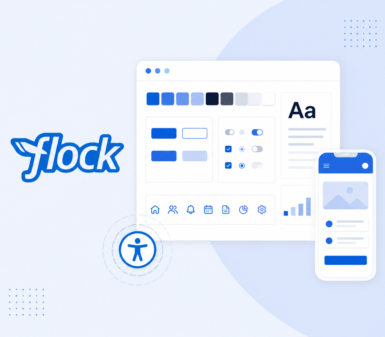
Led an accessibility audit and helped unify the design system. This reduced pattern debt, made the product more consistent, and improved collaboration between design and development teams.
View case study →